How to Design a Teardrop Banner: 10 Expert Tips for Eye-Catching, Print-Ready Results
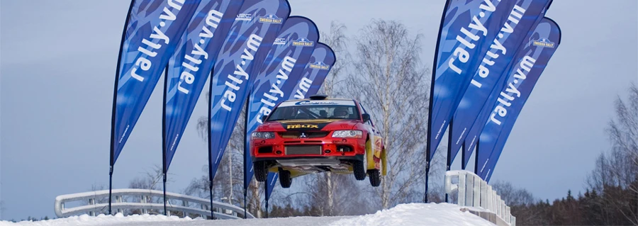
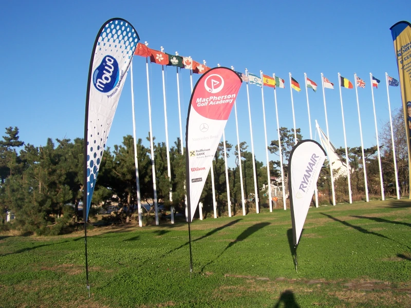
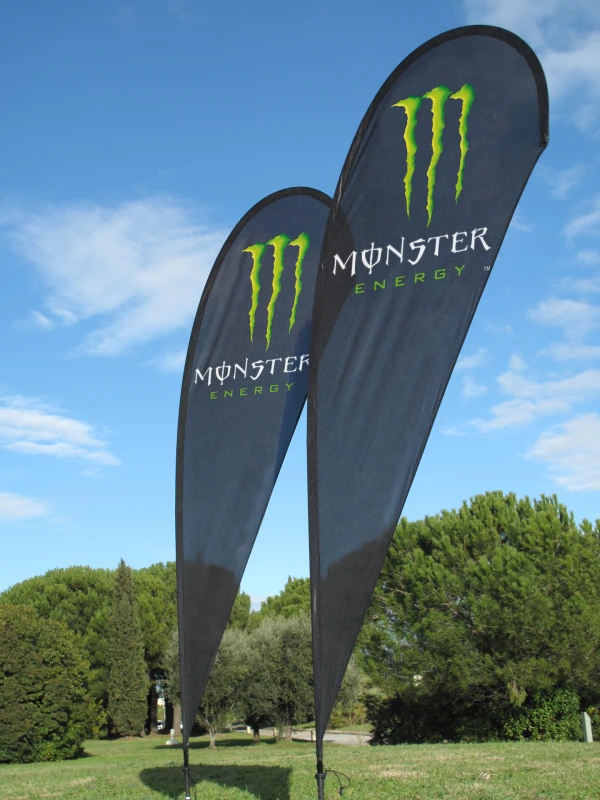
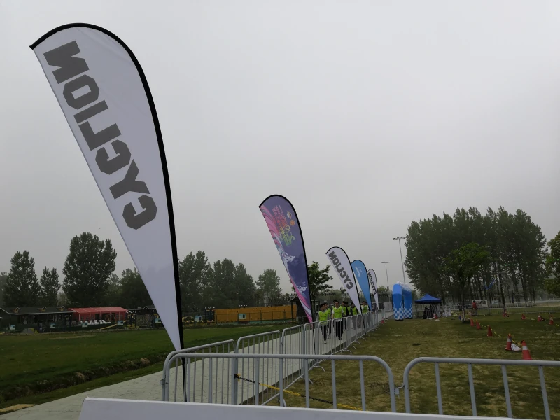
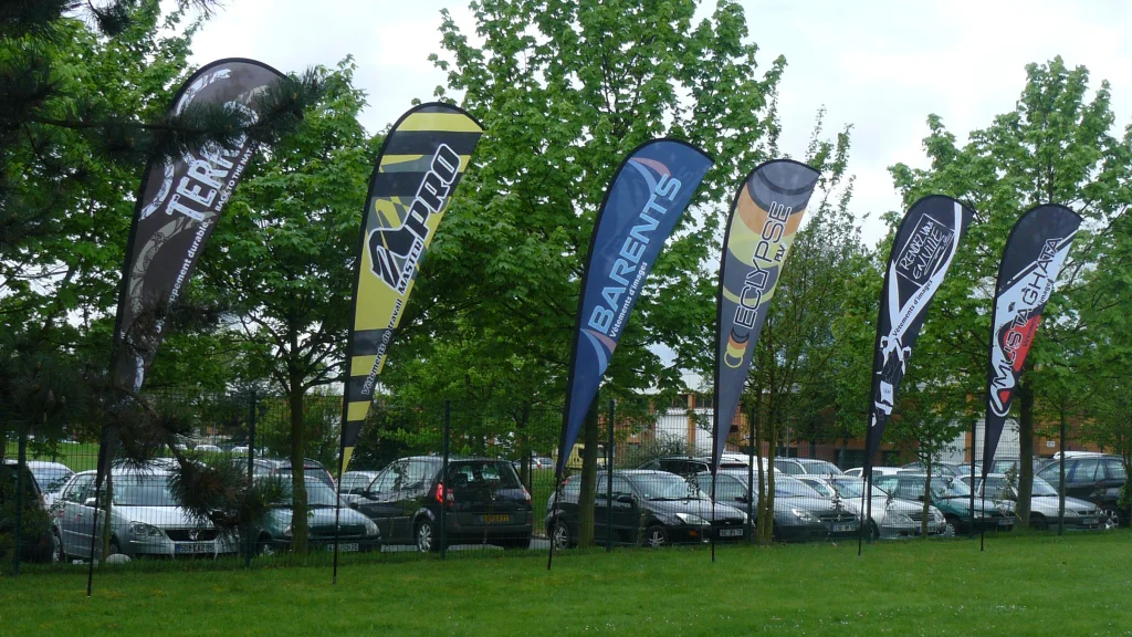
Teardrop banners are one of the most effective tools for high-visibility promotions. Their unique shape, lightweight structure, and adaptability make them ideal for events, storefronts, and trade shows. But a teardrop banner only works if it’s well-designed—and print-ready.
In this guide, we’ll show you how to design a teardrop banner that not only looks sharp but also meets production standards—avoiding costly mistakes or delays.
1. Understand the Shape, Space, and Print Requirements
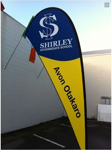
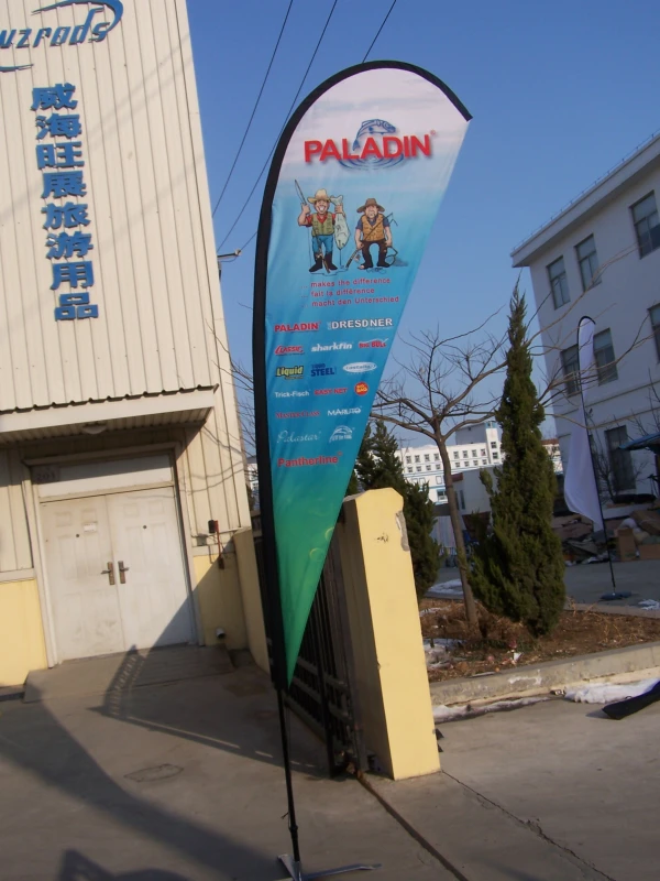
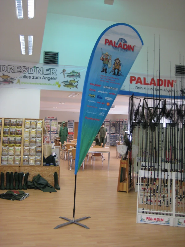
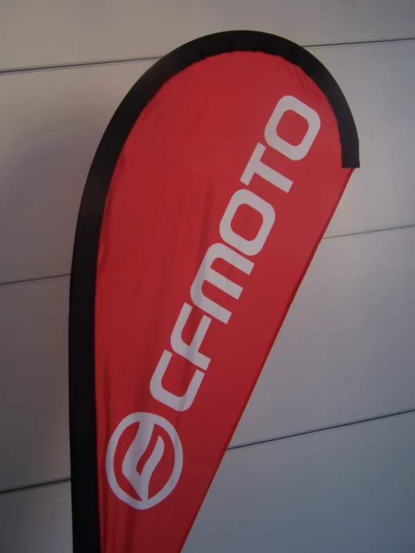
Teardrop banners have a curved, tapered shape. Most of the visual focus is near the top, while the bottom narrows down—so design space is not uniform.
- Top-heavy design: Place your logo or headline in the upper half.
- Avoid bottom clutter: Use the lower section only for secondary elements like contact info.
- Respect the live area: Keep all critical elements at least 3cm from the edge to avoid trimming or stitching loss.
Always use a template with bleed and safety zones. Design at full scale in Adobe Illustrator with layers, or submit a high-res PDF. We can provide templates upon request.
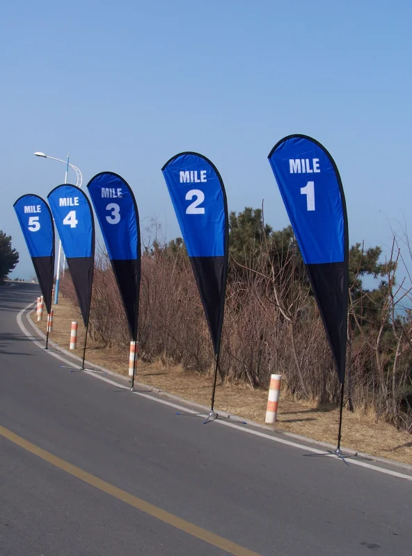
2. Define the Message Clearly and Keep It Short
Your teardrop banner has one job: be seen and understood quickly. Keep your message bold, brief, and clear.
- Branding: Use your logo and a tagline.
- Promotion: Include a strong CTA like “50% OFF” or “VISIT US TODAY.”
- Wayfinding: Simple directionals like “Booth A12 →”.
Five words or fewer is a solid benchmark.
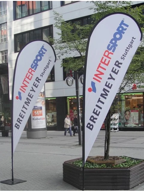
3. Use Bold Fonts and Strong Contrast
Your banner should be readable from a distance. Use bold, sans-serif fonts like Arial, Helvetica, or Montserrat. Avoid script fonts or thin lines. Maximize legibility with high-contrast color combinations (e.g., black on yellow, white on red).
Important: Outline all fonts before submitting your files.
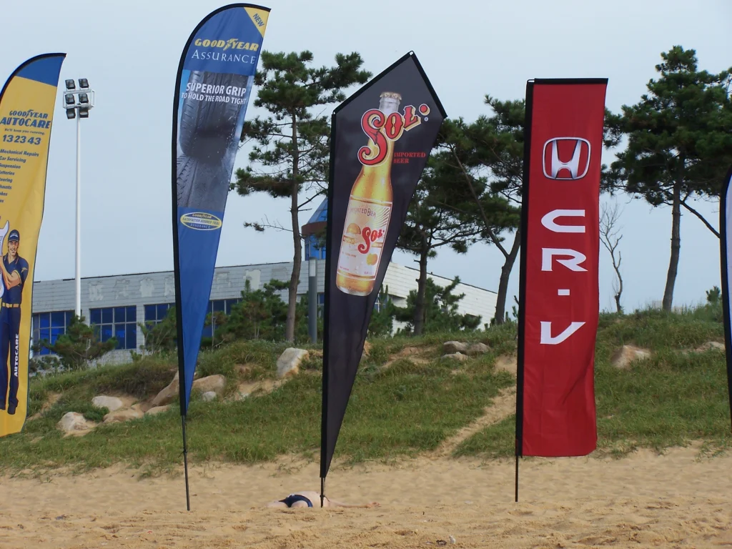
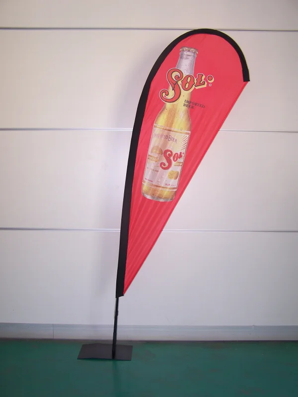
4. Design Vertically, Not Horizontally
Teardrop banners are vertical by nature. Design content top-to-bottom, not left-to-right. A typical layout includes:
- Logo or main icon
- Headline or key message
- Website or secondary text (optional)
Think of your design as a vertical story, guiding the viewer’s eye downward.

5. Use High-Resolution, Print-Ready Artwork
Ensure all artwork—logos, photos, gradients—are print-quality:
- Minimum 100 dpi at full size
- Use PNG for raster images
- Avoid low-resolution JPEGs
- Supply Pantone/CMYK values if color accuracy is critical
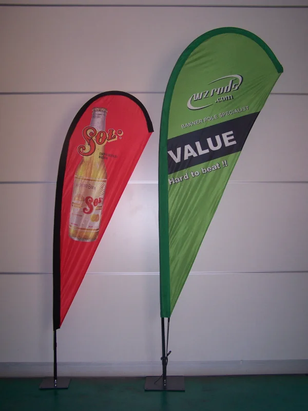
6. Stick to Your Brand, But Consider Context
Use your official colors, fonts, and logos—but also consider the display environment. If your banner may blend into the background, adjust for contrast while staying brand-consistent.
7. Don’t Overdesign—Use Space Wisely
White space improves readability and professionalism. Don’t overcrowd your design. Remember: banner sleeves are black by default. Specify if you need a different color.
8. Prep Files Correctly to Avoid Reprints or Delays
Before submitting your design files:
- Create artwork in Illustrator CS or supply a high-resolution, layered PDF
- Design at final size using our template with bleed
- Outline all fonts
- Flatten transparency and disable overprint settings
- Provide all linked files (do not embed low-res previews)
- Do not compress the final PDF
If using Photoshop, submit a layered PSD at full size (100 dpi), but be aware text and logos may not retain vector quality.
9. Test Your Design Before Final Submission
Preview the banner at full scale. Either zoom to 100% on screen or print a mockup. Check alignment, sharpness, and visibility.
Tip: Ask a colleague—“What do you notice first?” If it’s not your message, revisit the design.
10. Need Help? We’re Here
If you'd prefer professional support, we’re happy to design it for you. Just send:
- Editable AI or layered PDF files
- Images in PNG format, 100 dpi at full size
- Clear layout instructions and sleeve color requirements
Email your files to: info@wzrods.com
With over 20 years of experience in custom banner printing, WZRODS ensures your teardrop banner not only looks great—but prints exactly as it should.
Also read: How to Choose a Feather Flag Base – Learn which base works best for your teardrop banner based on environment and usage.